o9 Brand Guidelines
Introduction
Foreword
Our brand guidelines define how we look, sound, and communicate. It keeps every message clear, consistent, and connected. So, every interaction with o9 reflects our purpose, style, precision and creativity. We therefore look better, sound better, and position ourselves better to the outside world.
Logo
Primary Logo
The primary o9 logo lives inside a box. To keep our brand consistent, use it with the correct background colors. On white backgrounds, use the black square logo. On black backgrounds, use the white square logo. Simple and intentional.

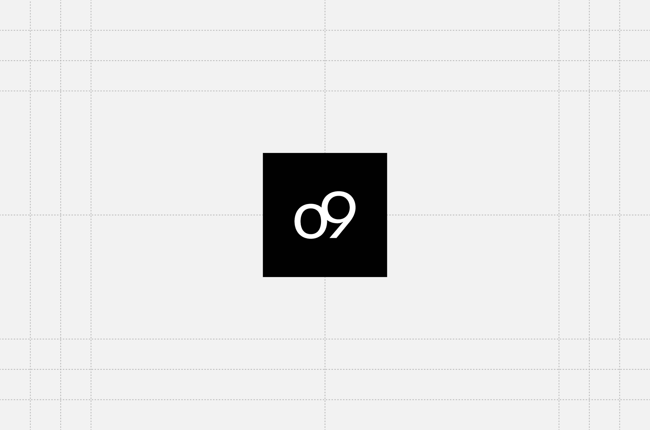
Primary [black]
HEX #000000
CMYK 60,40,40,100
Secondary Primary [white]
HEX #FFFFFF
CMYK 0,0,0,0
Positioning

The logo can appear in the corners
Or central to the page
Logo in-situ

Things to avoid


Partner Logo
We’ve created a central repository of all past and current client and partner logos. When assets feature logos alongside the o9 logo, use our modular design system for consistency. Each logo is available in two versions: full color and black.

Horizontal Lock-up
When we display a partner’s logo alongside ours, we set it at the same height as our Fast Flag so it’s consistent. We use its width to create enough cspace between the two.

Vertical Lock-up
When vertically stacking a partner’s logo, it is always placed below ours. We align their logo to the same width as ours and use the height of our primary logo to maintain appropriate spacing between them.

Example I

Example II
Color
Palette Primary
Black represents sophistication and strength. It adds depth and contrast—best used for text, backgrounds, and to convey authority.
White brings simplicity and clarity. It enhances readability and lets other colors shine—ideal for negative space and clean layouts.
Fluorescent Orange adds energy and impact. Use it sparingly (no more than 5%) to highlight key elements or calls to action with a bold, dynamic touch.

Primary palette
Gradient | Gen AI
The orange gradient is the evolution of our accent color. It should appear prominently across key brand assets, reinforcing that AI sits at the heart of everything we do. The gradient represents motion, connection, and transformation. The color adds intelligence and adaptability to our visual identity.

Palette Secondary
Our secondary palette provides range and flexibility across applications. It introduces depth, energy, and variation while maintaining harmony with the core brand colors. Used thoughtfully, this extended spectrum supports illustration, data visualization, and storytelling without overwhelming the simplicity and clarity of the o9 identity.

Secondary palette
Pairings
Our color pairings are built for clarity and contrast. The palette scales from deep neutrals to vibrant accents, ensuring accessibility while supporting a wide range of moods and applications. Each pairing maintains visual balance and reinforces the simplicity and precision of the o9 identity.


Typography
Typeface
We needed a typeface that reflects who we are—modern, intelligent, and adaptable. Function and legibility come first, but we added subtle contrast and refined shapes to bring character and distinction.
The result is o9 Sans, our primary typeface, paired with o9 Sans Mono for details. Together, they create a clear, flexible, and unmistakably o9 style.

Primary Typeface

Secondary Typeface
Creative Resources
Our brand guidelines define how we look, sound, and communicate. Guidelines keep every message clear, consistent, and connected. So, every interaction with o9 reflects our purpose, style, precision and creativity. Our commitment to this mission means we will look better, sound better, and position ourselves better to the outside world.
on this page